Agent activity
Checking for WebMCP support
Requests are only sent after you confirm them. How this works
retail analytics
Heatmap analytics that show which parts of a space are actually used
In short
Ayonix heatmap analysis visualises the areas of a camera view that attract the most activity, accumulated over a chosen period. It shows which aisles, entrances and zones are used and which are ignored, providing an aggregate basis for layout, staffing and merchandising decisions without identifying anyone.

Scope
What this analytic does, and what it does not
What it detects
- Accumulated presence intensity across the camera view
- Relative activity between areas of the same floor
- Change in activity distribution between comparable periods
- Areas with consistently low activity across the reporting period
What it does not guarantee
- An exact number of people in any area — a heatmap shows relative intensity
- Comparison between cameras with different angles or coverage
- Any causal explanation for why an area is busy or quiet
- Individual movement paths or identification
The problem
What customers are actually dealing with
These are the situations that lead teams to look at this analytic in the first place.
- Floor space is allocated by convention and nobody knows which areas are genuinely dead.
- A refit is proposed with no measurement of how the current layout is used.
- Staff report that an aisle is quiet but there is no evidence to support reallocating space.
- Seasonal changes in how a space is used are invisible because nothing is measured continuously.
How it works
Detection workflow
Every event carries the rule that produced it, so an operator can see why they were alerted.
- 1
Ingest and detect
Floor cameras are read and people are detected and tracked.
- 2
Project to ground plane
Track positions are mapped to floor positions where the camera calibration supports it.
- 3
Accumulate
Presence is accumulated into a spatial grid over the reporting period.
- 4
Normalise
The grid is normalised so intensity is comparable across the period and against a baseline.
- 5
Publish
The heatmap is rendered as an overlay with a legend and stored for period comparison.
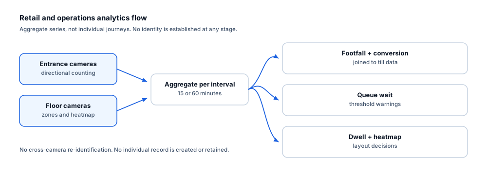
Configuration options
- Accumulation period — hourly, daily, weekly or a custom campaign window
- Grid resolution, balancing spatial detail against statistical stability
- Areas of the frame excluded from accumulation, such as a window or a service corridor
- Normalisation basis so periods of different length can be compared fairly
- Trading-hours schedule to exclude restocking and cleaning activity
- Baseline periods retained for before-and-after comparison
Alert quality
How irrelevant and duplicate alerts are reduced
No video analytic eliminates false alerts. These are the mechanisms that reduce them, and the residual rate is measured on your own cameras.
- Longer accumulation periods produce more stable maps; a single hour of data is rarely conclusive.
- Excluding closed hours prevents staff activity from dominating the map.
- Normalisation makes periods of unequal length comparable rather than merely adjacent.
- Grid resolution is chosen so each cell accumulates enough observations to be meaningful.
- A heatmap shows relative intensity within one camera view and should not be read as a count.
- Accumulated intensity still carries perspective bias and occlusion artefacts that no accumulation period corrects. The map is indicative of relative activity rather than a measured count, and comparisons between cameras remain invalid unless the views are genuinely equivalent.
Prerequisites
Camera requirements and environmental limits
Camera suitability decides more of the outcome than any software setting. These are assessed per camera before commitment.
Camera requirements
- An elevated, downward view over the floor area — the higher and more vertical, the better the spatial mapping
- Coverage of a complete, meaningful area rather than a fragment of an aisle
- Even lighting across the floor area, avoiding a mix of bright and deeply shaded regions
- Stable mounting, since any camera movement invalidates accumulated spatial data
- Sufficient resolution at the far end of the covered area
Environmental limitations
- Perspective distortion means a near-horizontal camera produces a heatmap that over-weights the foreground.
- Fixtures that occlude the floor create artificial cold spots.
- Maps from different cameras are not directly comparable unless the views are genuinely equivalent.
- Camera movement, even slight, breaks comparability with earlier periods.
Delivery
Alerts, evidence and where they land
Event and evidence fields
- Camera and floor area
- Accumulation period start and end
- Normalisation basis
- Grid resolution
- Excluded regions
- Baseline period reference where a comparison is stored
VMS integration
Heatmaps are a planning output rather than an operator notification and belong on the operational dashboard. They are typically exported for use alongside floor plans in merchandising and facilities reviews.
See compatibility states →Deployment options
- Edge processing so only the accumulated grid, not video, leaves the site
- On-premise processing where floor cameras already aggregate locally
- Multi-site deployment where comparable store formats are benchmarked against each other
Measurement
Dashboard metrics and pilot acceptance criteria
Acceptance thresholds are agreed with you before the pilot starts. This site publishes no benchmark figures, because they do not transfer between sites.
Dashboard metrics
- Accumulated intensity map per camera per period
- Ranked zones by intensity
- Period-over-period change map
- Percentage of floor area in the lowest intensity band
- Campaign window comparison against baseline
- Camera availability during accumulation
Measurable pilot criteria
- Map stability between two comparable weeks under unchanged layout
- Agreement between measured high-intensity areas and independent observation
- Sensitivity check — does a deliberate layout change produce a visible, expected change?
- Data completeness across trading hours for the accumulation period
- Confirmation that excluded regions behave as configured
Governance
Privacy and governance
- The output is an aggregate spatial grid. It contains no identity, face template or individual path.
- Grids can be retained long term without retaining any imagery.
- Where a view includes staff working positions, employee monitoring obligations may apply.
- Grid resolution should be coarse enough that individual behaviour cannot be reconstructed.
Frequently asked questions
Is a heatmap a count of people?
No. It shows relative activity intensity accumulated across a period within a single camera view. For numbers, use people counting or occupancy. The two are complementary: counting tells you how many came in, the heatmap tells you where they went.
How long should we accumulate before drawing conclusions?
Long enough to cover the variation you care about. A single day reflects that day’s weather and promotions. Most layout decisions use at least two to four weeks so weekday and weekend patterns are both represented.
Can we compare heatmaps between two stores?
Only where the camera views are genuinely comparable in height, angle and coverage. Otherwise the differences in the map reflect the cameras rather than the shoppers. Cross-site comparison is designed during the readiness review, not assumed afterwards.
Keep reading
Related solutions and industries
Related solutions
-
Customer flow analytics
Combine directional counting, dwell and heatmaps to show how visitors move through a space, whic…
-
Dwell time analytics
Measure how long people remain in defined areas such as counters, displays and waiting halls, an…
-
People counting
Count directional footfall across a virtual line using existing cameras, compare peak periods an…
-
Occupancy analytics
Report how intensively rooms, floors and zones are used over time, so space, cleaning and energy…
Where it is used
-
Retail
Video analytics for stores that already have the cameras
-
Shopping malls
Video analytics for shopping centre leasing and operations
-
Hospitality
Video analytics for hotel and venue public areas
-
Airports
Video analytics for airport terminals and airside boundaries
- Author
- Gabriel Bamola, Chief Marketing Officer, Ayonix
- Technical review
- Dr Sadi Vural, Founder and Chief Executive Officer, Ayonix
- Published
- Last reviewed
Evaluate heatmap analytics on your own cameras
A controlled pilot establishes what this analytic actually does in your environment, against acceptance criteria we agree before it starts. Send a sample video first if you would rather see an assessment before committing to a pilot.